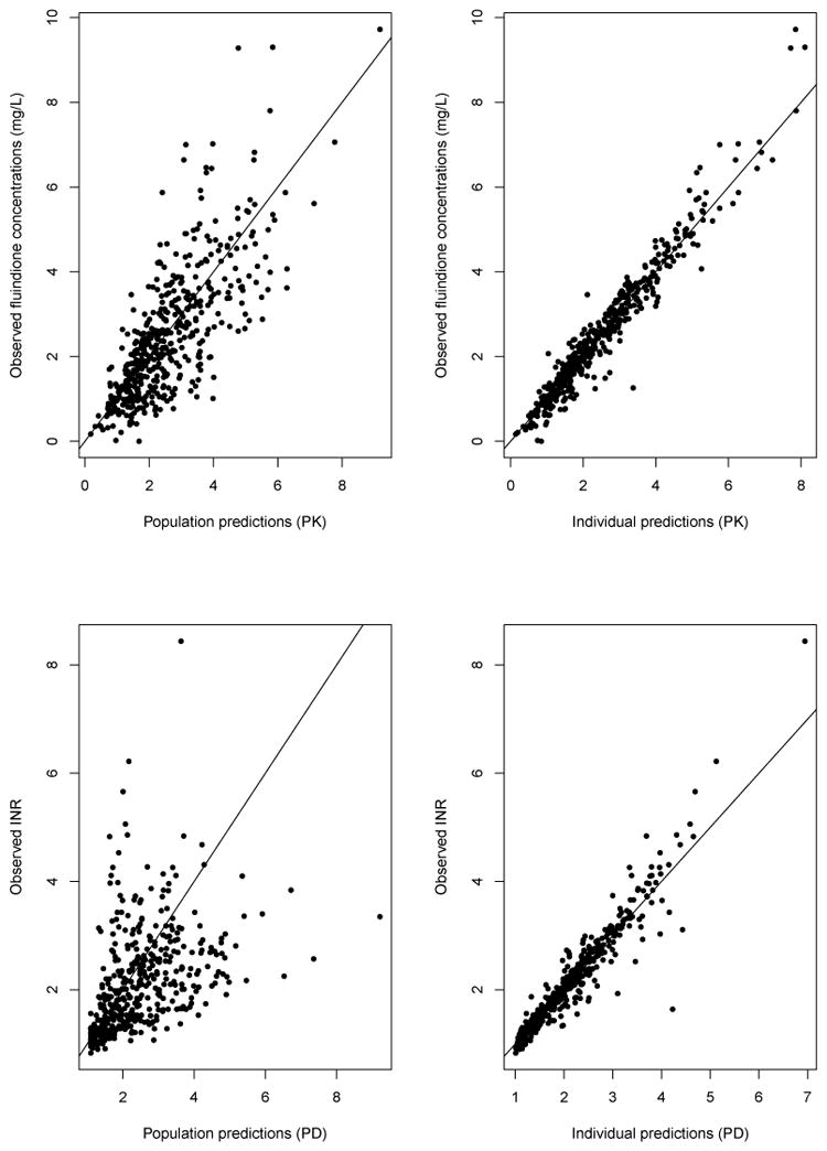
Figure 2.
Goodness-of-fit plots: (top) observed versus predicted fluindione concentrations; (bottom) observed versus predicted INR. The plots on the left were obtained with population parameter estimates, while the plots on the right were obtained with individual parameter estimates. The solid line represents the unity line around which points are expected to scatter evenly.